A dashboard application that connects to the Toggl API to display tracked time.
Author
Mark Edney
Published
March 12, 2024
Introduction
Do you lead a busy life? It sure feels like it, but how do you truly know how you spend your time? Would you like to focus your time on specific projects or specific tasks?
The solution is to start tracking you time. I personally, started tracking my time almost five years ago when I had multiple jobs. I was a full-time graduate student with a few part-time job. This created a demand on my time and I needed to manage my time well.
I learnt about Toggl, a free easy to use time tracking application. It is simple to use on android with additional feature on their website. You simply start at timer and save it under a project. You can also capture the task which may be distinct from the project.
Its really up to your own whims on the definition of project. You can track one-off task, like a household repair, but I try to keep these tasks grouped together in a unified project.
I hadn’t really done anything with the data I created tracking my time, so I thought it would be a great opportunity to learn how to create a dashboard in python.
Initialization
As always, we start with loading our python packages. There isn’t really anything out of the ordinary, we will use the requests library to make our API call. You will need to create an account at the Toggl website and create a API key.
I’ve saved the API key in my environmental variables, it is loaded into the script with the os.environ function. You also need to create a header for the API call, this is the part that caused the most difficulty for me as it is very specific in the format.
Code
import pandas as pdimport osimport base64import requestsimport jsonimport matplotlib.pyplot as pltimport seaborn as snsimport numpy as npkey = os.environ['Toggl']string=key+':api_token'headers={'Authorization':'Basic '+base64.b64encode(string.encode('ascii')).decode('utf-8'),"Content-Type": "application/json"}
Toggl API
This section goes more into the details for the API. The call accepts the following parameters: since for your starting date, until for you finishing date, user_agent this is your user account email and workspace_id which is found on the Toggl website when you click on your workspace. I have kept mine secret, you will need to replace them with your own values.
With the header and parameters for the API call setup, we can now use the requests package to make the actual call. The API call returns a json document, for ease I will convert that json into a dataframe. We can than analyze what the API call has returned.
The issue with this method is that it only returns a limited number of values. We can see it only returned 50 time entries.
Code
print(len(df))
50
To collect all entries within the time frame, we need to try something a little different. The json file does include two important attributes, the total count and the number of entries per page. With these two values, we can loop through all the pages of entries and concatenate them into a single dataframe. The previous attempt already retrieved the first page so we can start at the second. I also included some simple data cleanup to remove null entries and change the duration values into hrs.
Before creating any complicated graphics for our dashboard, we should make a simple graphics. In this graph we total the duration’s and split them by their labeled project. I use the sns.barplot from theseaborn library because it is well designed and simple to use. This simple graph, shows the total number of hours attributed to each project.
Code
sns.barplot(x='project', y='dur', data = df, estimator ='sum', hue='project')plt.xticks(rotation=45)
The dash dashboard has a pretty simple construction. I start with loading the libraries required. The basic libraries include ‘Dash’ for the basic functions, ‘html’ to design the dashboard layout with html and ‘dcc’ for adding additional core components including radio-buttons and graphs.
Interactive graphs require some additional work. Interactive graphs require the use of the ‘callback’, ‘Input’ and ‘Output’ libraries. The input function is used to define the behaviour of the input componets, sush as the radio button. We assign the button an id and define that the component returned is the ‘value’.
I’ve also taken some monthly average values by using the group_by method. This creates a new dataframe which has multi-indexes which doesn’t work well with plotly express graphs. I drop the indexes to column values with the reset_index method. I finished the summary data by sorting it by the start time with the sort_values method.
Code
# Import packagesfrom dash import Dash, html, dash_table, dcc, callback, Output, Input, jupyter_dashimport pandas as pdimport plotly.express as pxjupyter_dash.default_mode="external"# Initialize the appapp = Dash(__name__)df2= df.groupby(['Month', 'project']).sum().reset_index().sort_values('start')
The next stage of the dashboard is the app.layout. This forms the skeleton of the dashboard and as such utilizes some basic html. Through some experimentation, I have found I’ve liked the styling of the tabs. With the tabs, I can display different content on different tabs. Some tabs will be interactive while others will not.
Tabs are created with the dcc.Tabs function were you provide a list of dcc.Tab functions as children. For any interactive component, you have to provide an “id” so you can reference to it later, this includes the tab setup itself. For this dashboard I’ve decided to have a Datatable on tab one, an interactive annual review chart on tab 2, and a monthly review chart on tab 3. I decided to only make tab 2 interactive as the chart in tab 3 already has some basic interactive features by the nature of being a plotly express graph.
The next stage is the callback functions which runs whenever an input component is changed. Mainly, it is where the interactive inputs and output are declared. You declare them with the previously mention Output and Input functions. It is here were you reference the components based on the ids that you have called them. Your outputs need to be declared prior to your inputs and the order of your inputs will affect your update function. The second part of each declaration is the component that is effected.
The final step is to define the effect on your interactive elements in an update function. There are two components here for our dashboard, the updates due to the tab change and the updates from the radio button in the graph on tab 2. With an if statement, we return an HTML Div function/element with the corresponding content for that tab number. For those not familiar with HTML, a Div is just some user defined section.
Code
def render_content(tab, hist):if tab =='tab-1':return html.Div([ dash_table.DataTable(data=df.drop('tags', axis =1).to_dict('records'), page_size=10) ])elif tab =='tab-2':return html.Div([ dcc.Graph(figure = px.histogram(df, x='project', y='dur', color ='description', histfunc = hist),id='controls-and-graph') ])elif tab =='tab-3':return html.Div([ dcc.Graph(figure = px.line(df2, y ='dur', x ='Month', color ='project', markers=True)) ])# Run the appif__name__=='__main__': app.run(debug=True)
Dash app running on http://127.0.0.1:8050/
Our program has now run a server to host the dashboard. You view the dashboard by opening the hyperlink or going to the default address ‘http://127.0.0.1:8050/’ in your internet browser. The server is host localy, mean I can not easily display the interactive features.
Conclusion
We have connected to the Toggl service with an API call. With this API call, we collected a years worth of time tracking data to create a local dataframe. Exploring the data with graphs helped us understand the structure and the quality of data in our dataframe. A simple dash dashboard was created with some interactive features takes to the Input and Output functions. This dashboard has multiple tabs, display different types of data on each tab. The first tab simply shows a table of the data as illustrated in the following image:
On the second tab, we’ve created an interactive chart that uses a radio button. This radio button controls how the data in our chart will be aggregated.
And on the final tab, we created a interactive graph with the plotly express library. This chart summaries or data on a month by month basis.
Source Code
---title: Tracking you time dashboard featuring Toggl APIauthor: Mark Edneydate: 2024-03-12categories: [How-to,Python,Dashboard]draft: falsedescription: 'A dashboard application that connects to the Toggl API to display tracked time.'image: 'images/tab3.png'archives: - 2024/03toc: falseengine: jupyterexecute: enabled: trueformat: html: code-fold: show code-tools: true---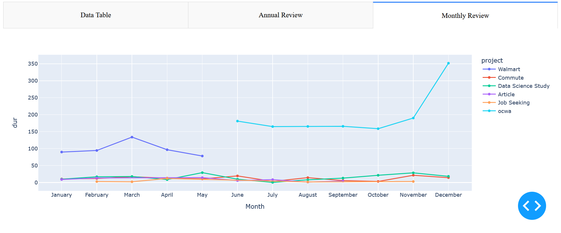# IntroductionDo you lead a busy life? It sure feels like it, but how do you truly know how you spend your time? Would you like to focus your time on specific projects or specific tasks?The solution is to start tracking you time. I personally, started tracking my time almost five years ago when I had multiple jobs. I was a full-time graduate student with a few part-time job. This created a demand on my time and I needed to manage my time well.I learnt about Toggl, a free easy to use time tracking application. It is simple to use on android with additional feature on their website. You simply start at timer and save it under a project. You can also capture the task which may be distinct from the project.Its really up to your own whims on the definition of project. You can track one-off task, like a household repair, but I try to keep these tasks grouped together in a unified project.I hadn't really done anything with the data I created tracking my time, so I thought it would be a great opportunity to learn how to create a dashboard in `python`.# InitializationAs always, we start with loading our python packages. There isn't really anything out of the ordinary, we will use the `requests` library to make our API call. You will need to create an account at the Toggl website and create a API key.I've saved the API key in my environmental variables, it is loaded into the script with the `os.environ` function. You also need to create a header for the API call, this is the part that caused the most difficulty for me as it is very specific in the format.```{python}import pandas as pdimport osimport base64import requestsimport jsonimport matplotlib.pyplot as pltimport seaborn as snsimport numpy as npkey = os.environ['Toggl']string=key+':api_token'headers={'Authorization':'Basic '+base64.b64encode(string.encode('ascii')).decode('utf-8'),"Content-Type": "application/json"}```# Toggl APIThis section goes more into the details for the API. The call accepts the following parameters: `since` for your starting date, `until` for you finishing date, `user_agent` this is your user account email and `workspace_id` which is found on the Toggl website when you click on your workspace. I have kept mine secret, you will need to replace them with your own values.```{python}params = {'since':'2020-01-01','until':'2020-12-31','user_agent': 'email','workspace_id' : "workspace"}``````{python}#| echo: falseparams = {'since':'2020-01-01','until':'2020-12-31','user_agent': 'm2edney@gmail.com','workspace_id' : "3112792"}```With the header and parameters for the API call setup, we can now use the requests package to make the actual call. The API call returns a json document, for ease I will convert that json into a dataframe. We can than analyze what the API call has returned.```{python}response = requests.get('https://api.track.toggl.com/reports/api/v2/details', headers = headers, params= params)my_json = json.loads(response.content)df = pd.DataFrame(my_json['data'])df['Month'] = pd.DatetimeIndex(df['start']).monthprint(df.columns, df.head(5))```The issue with this method is that it only returns a limited number of values. We can see it only returned `{python} len(df)` time entries.```{python}print(len(df))```To collect all entries within the time frame, we need to try something a little different. The json file does include two important attributes, the total count and the number of entries per page. With these two values, we can loop through all the pages of entries and concatenate them into a single dataframe. The previous attempt already retrieved the first page so we can start at the second. I also included some simple data cleanup to remove null entries and change the duration values into hrs.```{python}page_count =int(my_json['total_count']/my_json['per_page']) + (my_json['total_count'] % my_json['per_page'] >0)for page inrange(1, page_count): params['page']=str(page) response = requests.get('https://api.track.toggl.com/reports/api/v2/details', headers = headers, params= params) my_json = json.loads(response.content) df =pd.concat([df, pd.DataFrame(my_json['data'])])df['dur'] = df['dur']/1000/60/60df = df[~df['project'].isnull()]df = df.drop(['tid','updated', 'user', 'use_stop', 'client', 'project_color', 'project_hex_color', 'task', 'billable', 'is_billable', 'cur'], axis =1)df['Month'] = pd.to_datetime(df['start'], utc=True).dt.month_name()df= df.sort_values('start')print(len(df))```# Simple GraphicsBefore creating any complicated graphics for our dashboard, we should make a simple graphics. In this graph we total the duration's and split them by their labeled project. I use the `sns.barplot` from the`seaborn` library because it is well designed and simple to use. This simple graph, shows the total number of hours attributed to each project.```{python}sns.barplot(x='project', y='dur', data = df, estimator ='sum', hue='project')plt.xticks(rotation=45)```# Dash DashboardThe dash dashboard has a pretty simple construction. I start with loading the libraries required. The basic libraries include 'Dash' for the basic functions, 'html' to design the dashboard layout with html and 'dcc' for adding additional core components including radio-buttons and graphs.Interactive graphs require some additional work. Interactive graphs require the use of the 'callback', 'Input' and 'Output' libraries. The input function is used to define the behaviour of the input componets, sush as the radio button. We assign the button an id and define that the component returned is the 'value'.I've also taken some monthly average values by using the `group_by` method. This creates a new dataframe which has multi-indexes which doesn't work well with plotly express graphs. I drop the indexes to column values with the `reset_index` method. I finished the summary data by sorting it by the start time with the `sort_values` method.```{python}# Import packagesfrom dash import Dash, html, dash_table, dcc, callback, Output, Input, jupyter_dashimport pandas as pdimport plotly.express as pxjupyter_dash.default_mode="external"# Initialize the appapp = Dash(__name__)df2= df.groupby(['Month', 'project']).sum().reset_index().sort_values('start')```The next stage of the dashboard is the `app.layout`. This forms the skeleton of the dashboard and as such utilizes some basic `html`. Through some experimentation, I have found I've liked the styling of the tabs. With the tabs, I can display different content on different tabs. Some tabs will be interactive while others will not.Tabs are created with the `dcc.Tabs` function were you provide a list of `dcc.Tab` functions as children. For any interactive component, you have to provide an "id" so you can reference to it later, this includes the tab setup itself. For this dashboard I've decided to have a Datatable on tab one, an interactive annual review chart on tab 2, and a monthly review chart on tab 3. I decided to only make tab 2 interactive as the chart in tab 3 already has some basic interactive features by the nature of being a plotly express graph.```{python}# App layoutapp.layout = html.Div([ dcc.Tabs(id="tabs", value='tab-1', children=[ dcc.Tab(label='Data Table', value='tab-1'), dcc.Tab(label='Annual Review', value='tab-2', children=[ dcc.RadioItems(options=['avg', 'count', 'sum'], value='sum', id='controls-and-radio-item')]), dcc.Tab(label='Monthly Review', value='tab-3'), ]), html.Div(id='tabs-content')])```The next stage is the callback functions which runs whenever an input component is changed. Mainly, it is where the interactive inputs and output are declared. You declare them with the previously mention `Output` and `Input` functions. It is here were you reference the components based on the `id`s that you have called them. Your outputs need to be declared prior to your inputs and the order of your inputs will affect your update function. The second part of each declaration is the component that is effected.```{python}#|eval: false@app.callback( Output('tabs-content', 'children'), Input('tabs', 'value'), Input('controls-and-radio-item', 'value') )```The final step is to define the effect on your interactive elements in an update function. There are two components here for our dashboard, the updates due to the tab change and the updates from the radio button in the graph on tab 2. With an if statement, we return an HTML Div function/element with the corresponding content for that tab number. For those not familiar with HTML, a Div is just some user defined section.```{python}def render_content(tab, hist):if tab =='tab-1':return html.Div([ dash_table.DataTable(data=df.drop('tags', axis =1).to_dict('records'), page_size=10) ])elif tab =='tab-2':return html.Div([ dcc.Graph(figure = px.histogram(df, x='project', y='dur', color ='description', histfunc = hist),id='controls-and-graph') ])elif tab =='tab-3':return html.Div([ dcc.Graph(figure = px.line(df2, y ='dur', x ='Month', color ='project', markers=True)) ])# Run the appif__name__=='__main__': app.run(debug=True)```Our program has now run a server to host the dashboard. You view the dashboard by opening the hyperlink or going to the default address 'http://127.0.0.1:8050/' in your internet browser. The server is host localy, mean I can not easily display the interactive features.# ConclusionWe have connected to the Toggl service with an API call. With this API call, we collected a years worth of time tracking data to create a local dataframe. Exploring the data with graphs helped us understand the structure and the quality of data in our dataframe. A simple dash dashboard was created with some interactive features takes to the Input and Output functions. This dashboard has multiple tabs, display different types of data on each tab. The first tab simply shows a table of the data as illustrated in the following image: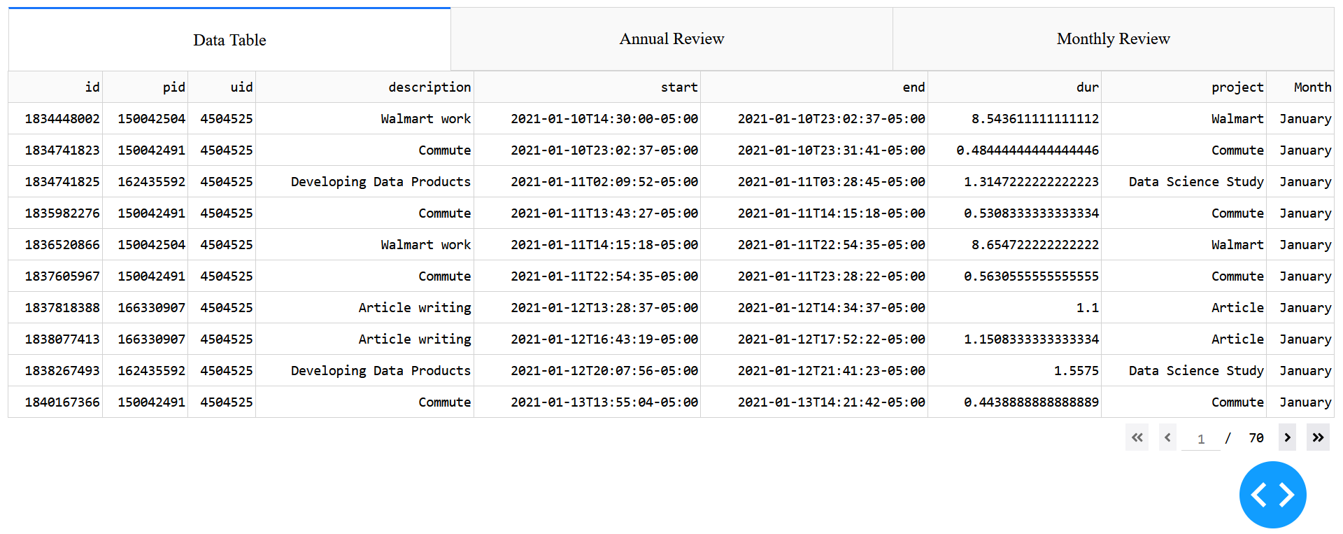{fig-align="center"}On the second tab, we've created an interactive chart that uses a radio button. This radio button controls how the data in our chart will be aggregated.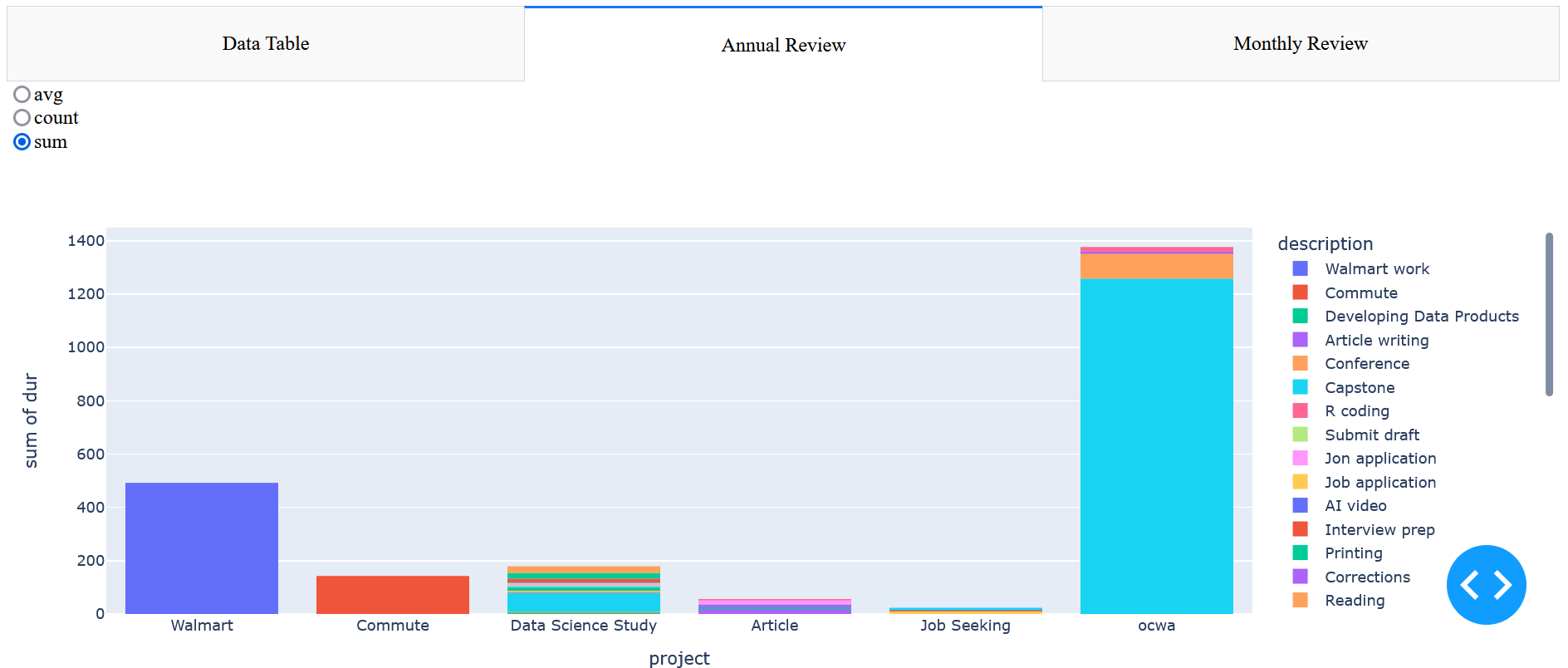And on the final tab, we created a interactive graph with the plotly express library. This chart summaries or data on a month by month basis.{fig-align="center"}


